
A rebrand built for real-world use
A brand that needed to work in person
SiSU Health's self-service stations needed more than a new look. The brand had to translate into an experience that was genuinely easier to use, consistent across every touchpoint, and accessible to a wide range of people.
Designing the experience end to end
- Designed end-to-end UX/UI for the self-service health measurement stations
- Created and scaled a design system and style guide for a consistent product experience
- Conducted concept testing and usability testing to validate design decisions
What was getting in the way
- Bringing a consistent brand across different platforms, from the self-service stations to mobile and web
- Low clarity in instructions, reducing user confidence in self-service interactions
- Accessibility gaps that made the experience harder for some users
- Users struggling to understand health measurements and results
- Balancing speed, accuracy and accessibility in a kiosk-based environment
Solving it, challenge by challenge
Each challenge shaped a specific decision, from the style guide through to how instructions and results appeared on screen.
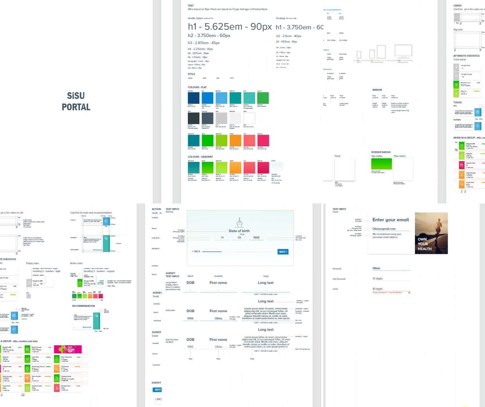
One style guide, every platform
To bring a consistent brand across platforms, I built a single style guide covering colour, type, components and spacing, then applied it across the health station, the responsive website and the app. Screens that once felt disconnected started reading as one product.


A flow you learn to expect
Health checks are usually repeated over time, so consistency needed to extend to the flow itself, not just the visuals. I mapped the full user journey for both the health station and the member portal, so each repeat visit followed the same structure, making the experience feel consistent and predictable rather than something to relearn every time.


Showing, not just telling
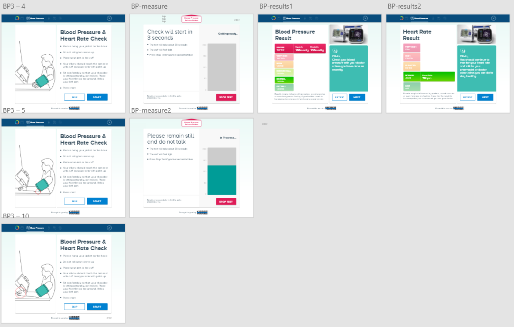
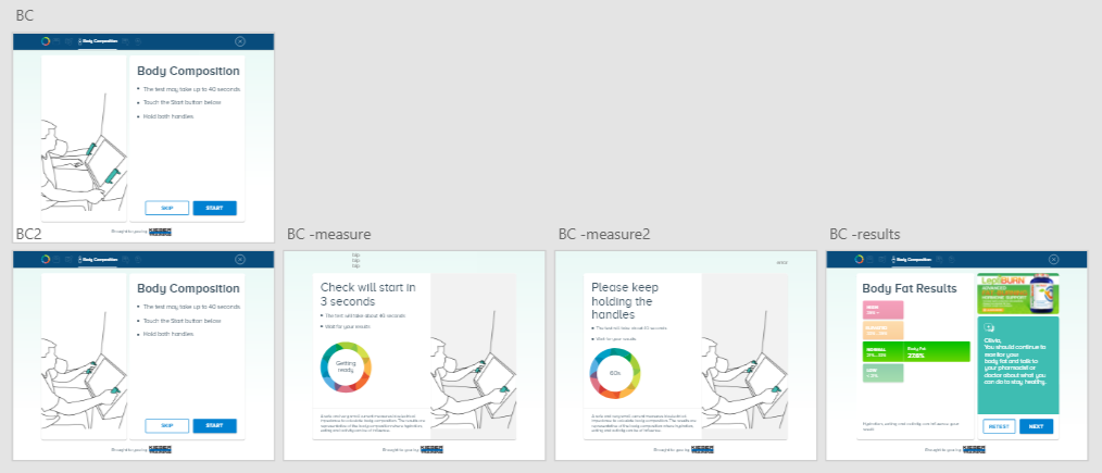
Instructions alone were not enough to build confidence. I introduced a series of illustrations played simultaneously as short animations, so people could see exactly how to interact with the kiosk while they read the instruction, rather than working it out on their own.
Accessible by default
Accessibility came down to getting the details right, the correct keyboard triggered for each field, for example numbers for a date of birth rather than a full letter keyboard, and colour contrast that passed WCAG AA throughout the style guide.


Results people can actually read
Results combined colour and text rather than relying on either alone, paired with plain labels and a short benchmark description, so people could understand what their numbers meant without needing to interpret it themselves.

One mental model, two platforms
The same visual style carried onto the website, so the mental model people learned at the health station carried over, reducing cognitive load rather than asking them to learn the product twice.

What changed
- Delivered a consistent, rebranded experience across every self-service station
- Improved task completion and reduced user drop-offs during measurements
- Increased user confidence in self-service health interactions
- Made the experience more accessible for a wider range of users
- Reduced the need for assisted support from staff, enabling true self-service usage
- Enhanced user understanding of health metrics and results interpretation
What this project taught me
Reflection
Designing for a phygital product means treating accessibility much like mobile, but for a different viewport entirely. Getting the foundations flexible, rather than fixed, was what let the same design system hold up across a kiosk, a phone and a browser.
- Accessibility for a phygital product is similar to mobile, but the viewport is different. Touch targets, text size and spacing all needed rethinking for the kiosk.
- Different fields need different keyboards. The keyboard triggered for a date of birth field is not the same as one triggered for a name field.
- Designing for multiple platforms means the design system foundation needs to be flexible. Using em instead of px meant components could be adjusted easily across different viewports.