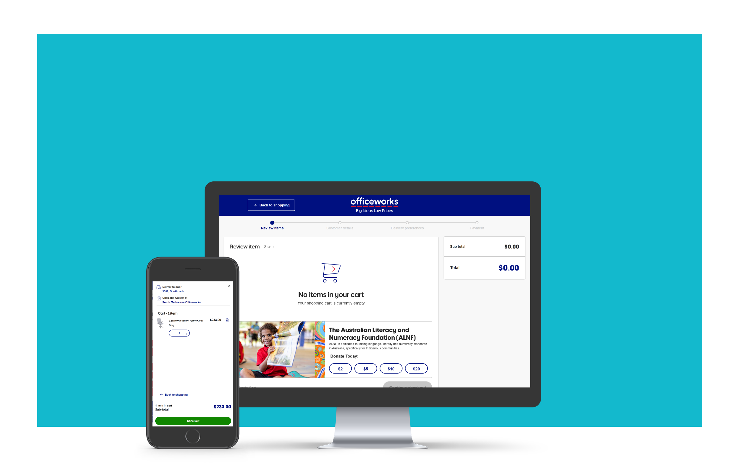
The starting point
Officeworks' desktop checkout conversion sat above the industry standard, but checkout time was too long and mobile conversion lagged behind. There was improvement available, but no shared picture of where to focus first.
Product owners needed evidence to prioritise improvements across the mini cart and checkout flow. My job was to build that evidence base, combining multiple research methods to give them a complete and defensible picture.
Research question
What do Officeworks customers expect from the checkout experience, and what is driving cart abandonment?
Six methods, deliberately combined
I chose a mixed-methods approach because no single method would have answered the question fully. Each method was chosen to cover a blind spot in the others.

The research told three connected stories
Rather than treating each method as a separate report, I synthesised across all five to find where the signals aligned, and where they diverged. That divergence turned out to be as important as the agreement.
Customers need to feel confident before they can be efficient
Interviews told me confidence was the most frequently cited need, not speed. NPS said the opposite, with 163 responses citing slow checkout as the top frustration. The difference came down to who was responding: NPS skewed toward frequent shoppers with recent negative experiences, while interview participants reflected on what they needed to feel ready to buy.
From interviews
"I would like to see all the details correctly at the end. So I know I've put the right address and phone number before I finally press checkout."
From NPS (n=613)
163 responses cited slow checkout as their top frustration , more than any other theme.
Cart abandonment has specific, fixable causes
Industry data confirmed cart abandonment is the primary commercial impact of a poor checkout experience. When I cross-referenced this with our NPS analysis and interview findings, five clear causes emerged, ranked by how frequently they were cited.
Officeworks was behind on mobile, ahead on desktop
The baseline metrics revealed a meaningful gap. Desktop conversion sat above the industry standard. Mobile conversion sat below it, and checkout time exceeded what customers said they were willing to wait on both platforms.
| Metric | Officeworks | Industry standard |
|---|---|---|
| Cart to checkout completion, desktop | 59.4% | 51.7% |
| Cart to checkout completion, mobile | 40.8% | 44.7% |
| Time to checkout, desktop | 4 min 47 sec | <2 min expected |
| Time to checkout, mobile | 4 min 22 sec | <2 min expected |
The competitor scan confirmed why mobile lagged. Only 2 of 12 competitors used adaptive mobile design (Amazon and eBay), which loaded faster and felt less cluttered. Officeworks was using a responsive design that was not optimised for the mobile checkout context.
What to fix, and why
Six recommendations grounded in the findings.
70.8% of cart abandonment was caused by hidden charges.1 Delivery costs, fees, and taxes need to appear in the mini cart and the first checkout step, not at the end.
7 of 12 competitors allowed mini cart editing. Interviews confirmed customers need to adjust quantities and remove items without losing their place in the shopping session.
Customers used the cart to decide, not just to hold items. Item images, stock levels, free shipping thresholds, and upfront payment options were all things customers needed before they were ready to commit.

6 of 12 competitors used a single-page scroll. At 4 min 47 sec on desktop and 4 min 22 sec on mobile, Officeworks checkout time far exceeded the 2-minute threshold at which 60% of customers abandon.

Mobile cart to checkout completion was 40.8% against an industry standard of 44.7%.2 Only Amazon and eBay used adaptive mobile design, and both loaded faster and converted better. Responsive design was carrying too much visual weight onto small screens.

9 of 12 competitors retained previously entered information. Interviews confirmed customers expected their details to be remembered. For purchases under $500, express checkout could significantly cut abandonment among logged-in customers.

References
- Sholl, N. (2022). Shopping Carts & Checkout. In Power Retail (Special report 22). Power Retail.
- Contentsquare. (2022). 2022 Digital Experience Benchmark Report Digital performance across 14 industries More. Human. Analytics. In Contentsquare. Retrieved December 21, 2022, from https://contentsquare.com/insights/digital-experience-benchmark/
What the research enabled, and where constraints shaped what moved forward
- Availability and delivery info surfaced earlier in PDP and mini cart, the system was too rigid to fix it inside checkout. Next is to surface the delivery cost and the free shipping threshold in mini cart.

- Express checkout explored but killed by budget. 3 years after, Apple Pay added, faster checkout without a structural overhaul.
What this reflects about enterprise research
In large organisations, research does not always lead directly to what it recommends. System rigidity and funding cycles shape what is possible. The value of this programme was in ensuring the team understood which constraints were real and which were assumptions, and in redirecting effort toward fixes that could actually land, rather than continuing to push for a checkout overhaul that had no path to funding.
What I would carry forward
Reflection
The most important finding from this programme was not a specific UX pattern. It was a misalignment between what different data sources were saying. NPS pointed to speed. Interviews pointed to confidence. Both were right, for different customer segments and different moments in the journey. A single-method approach would have told a partial story and led to a partial solution.
- Multiple methods reveal what one cannot. NPS showed speed as the issue; interviews showed confidence. Both were right for different customers.
- Quant shows what. Qual shows why. Pairing both gave the recommendations credibility with stakeholders who needed numbers, not just insights.
- Research output needs to be actionable, not just informative. Tying each recommendation to a finding made the pack usable.