What this system delivered
The situation
As UX Lead on the B2B digital replatforming programme at Officeworks, I identified a critical gap: there was no design system in place. Across multiple squads, designers were duplicating effort, UI patterns were inconsistent, and the disconnect between design and development was slowing delivery and creating quality issues.
Without a shared foundation, every team was making independent decisions, leading to a fragmented product experience, accessibility gaps, and significant rework between design and engineering. At the scale of the replatforming programme, this was a critical risk that needed to be addressed, not deferred.
The gap
No design system existed. Inconsistency, duplicated effort, and a broken design-to-development workflow were slowing delivery across squads working on a major platform overhaul.
What I was responsible for
I decided to establish a scalable design system grounded in accessibility, atomic design principles, and close collaboration with engineering, while continuing to deliver against the replatforming programme in parallel.
- Led a team of three designers in creating the Figma design library while delivering project work simultaneously
- Partnered with product, engineering, and design teams to define design tokens, reusable components, and interaction patterns aligned to accessibility standards
- Facilitated cross-functional collaboration and embedded the system into Figma and development workflows
- Produced clear documentation and governance to support adoption and consistent usage across teams
- Advocated for systems thinking, influencing stakeholders on the value of scalability, accessibility, and efficiency
How I built it
1. Set foundation
I established a robust design token framework covering colours, typography, and spacing, with accessibility guidelines baked into each component from the start. This created scalable rules for consistency and gave teams a shared language across design and code.
2. Set the scope
With no existing system to build from, I assessed the gaps across the replatforming programme and identified where consistency was most critical. I mapped out which component categories were needed, defined the boundaries of the system, and set realistic expectations with stakeholders on delivery.
3. Plan and prioritise
I partnered with Product Owners and the Tech Lead to prioritise component gaps based on delivery needs, frequency of use, and accessibility risk. This ensured the system was useful from day one while building toward a complete, scalable library over time.
4. Build Figma components
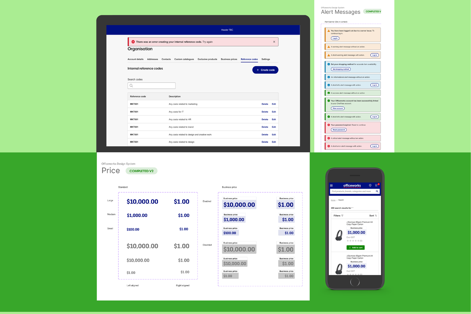
Working in real time alongside the replatforming project, I led the team in designing, refining, and documenting 51 UI components and interaction patterns, ensuring quality, WCAG AA accessibility compliance, and cross-platform readiness. I streamlined Figma workflows using libraries, plugins, and automation to improve versioning and reduce friction.
5. Sync design and dev
I partnered closely with engineers to ensure seamless implementation in Storybook and front-end builds, running weekly design-and-developer sessions and showcases to align teams and accelerate delivery.
6. Governance
I produced clear documentation and established governance structures to support adoption and consistent usage across squads, including agreed contribution workflows, review criteria, and ongoing refinements to reduce friction as the system scaled.
Detailed outcomes
Consistency
- 90% reduction in inconsistent UI patterns across B2B platforms
- Single source of truth established for designers and engineers across squads
Design-to-development efficiency
- 30% reduction in handoff time through tokenisation, documentation, and optimised Figma workflows
- 25% drop in clarification requests from developers, streamlining collaboration
Prototype-to-build accuracy
- 92.7% alignment between design and implementation, significantly reducing costly rework
- Accessibility compliance lifted to WCAG AA across core customer journeys
Scale
- 51 reusable components now adopted across multiple squads
- Governance structures and workflows established to ensure long-term scalability and adoption
- Embedded a design system mindset, nurturing a culture of continuous improvement and best practice
What I would carry forward
Key learning
Building a design system in parallel with live delivery is genuinely hard. The discipline was in making it real enough to be useful immediately, while scalable enough to serve the organisation long term. Getting stakeholder buy-in early, through evidence and education, was what made adoption possible.
- Design tokens are the invisible backbone — get them right before building any components, or you will be rebuilding components forever
- Governance is not bureaucracy: it is what separates a library from a design system. Without it, the system fragments the moment the original team moves on
- Shipping components in parallel with a live programme requires ruthless prioritisation. The right question is always: what does delivery need next week, and does it exist yet?